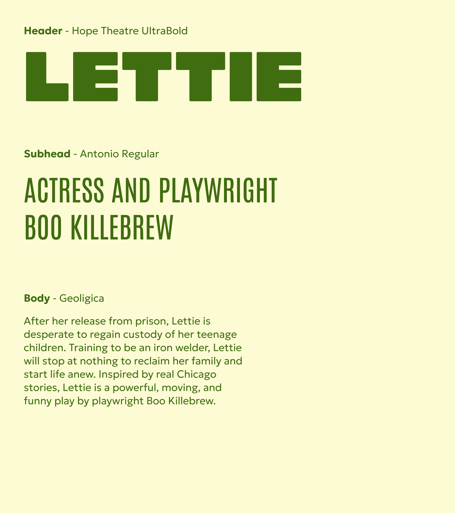
Hope Theatre
Branding / Type Design
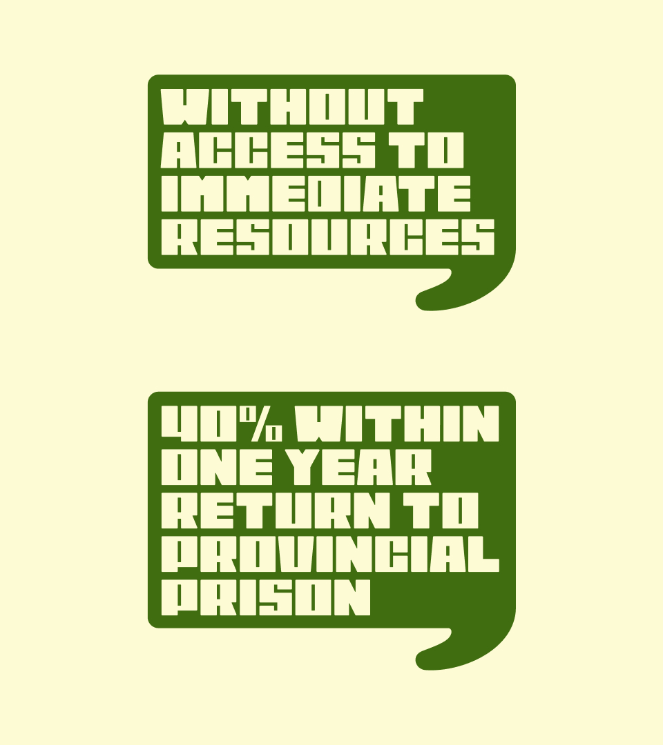
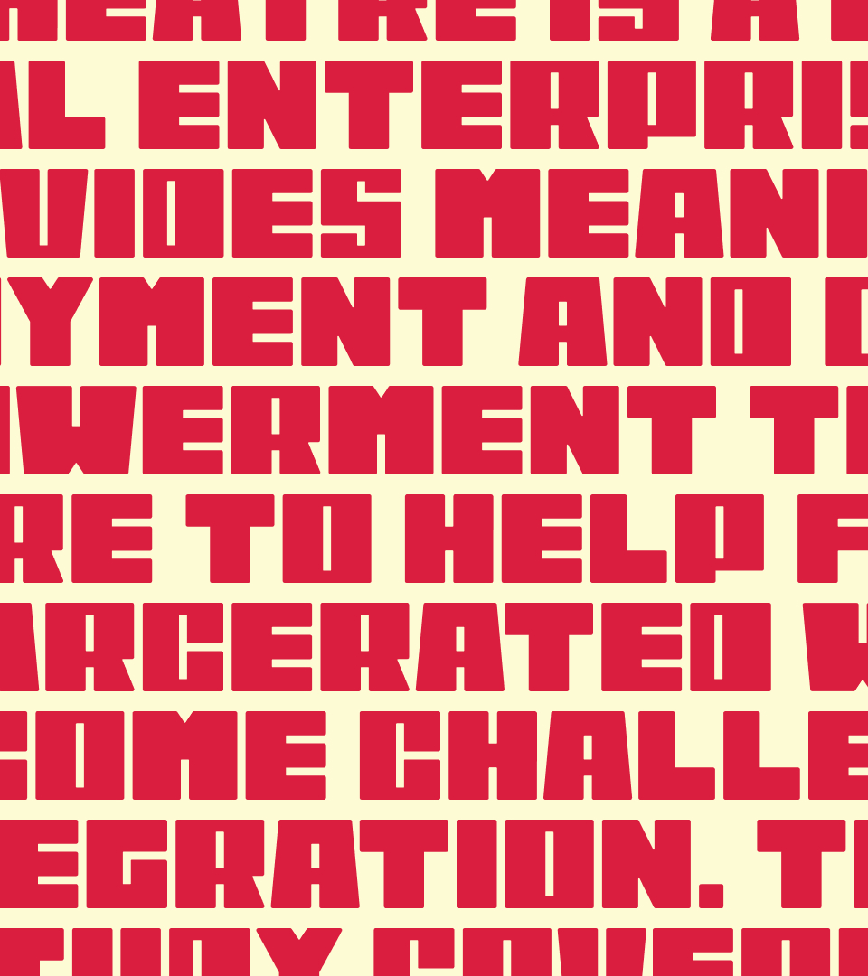
Hope Theatre is a social enterprise that provides meaningful employment and creative empowerment through theatre to help formerly incarcerated women overcome challenges of reintegration. This case study covers my contribution of art direction and branding.
Collaborators
Recognition
Descan, Jim Rimmer Scholarship, 2025
Applied Arts Student Awards, Logo Applications - Single, 2026
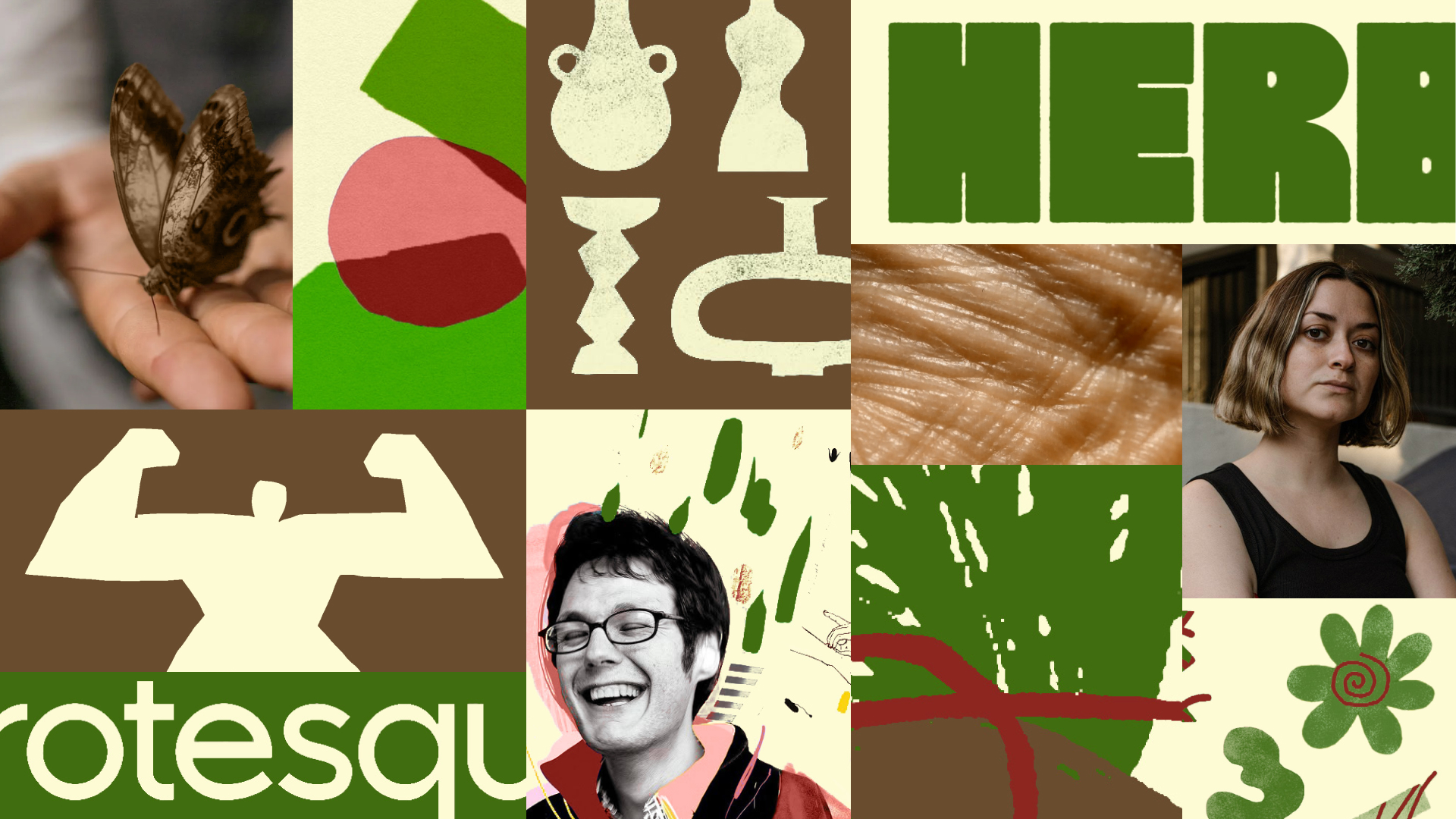
⤷ Mood board
Formerly incarcerated women struggle to regain confidence in their personal identities, they feel ashamed of their trauma and experiences, and are in need of community support—considering these points, the original mood board, art direction and brand positioning were chosen to evoke feelings of hope, connection, empathy and courage.
Symbols of hope and transformation like the butterfly, and things related to storytelling like punctuation were explored.
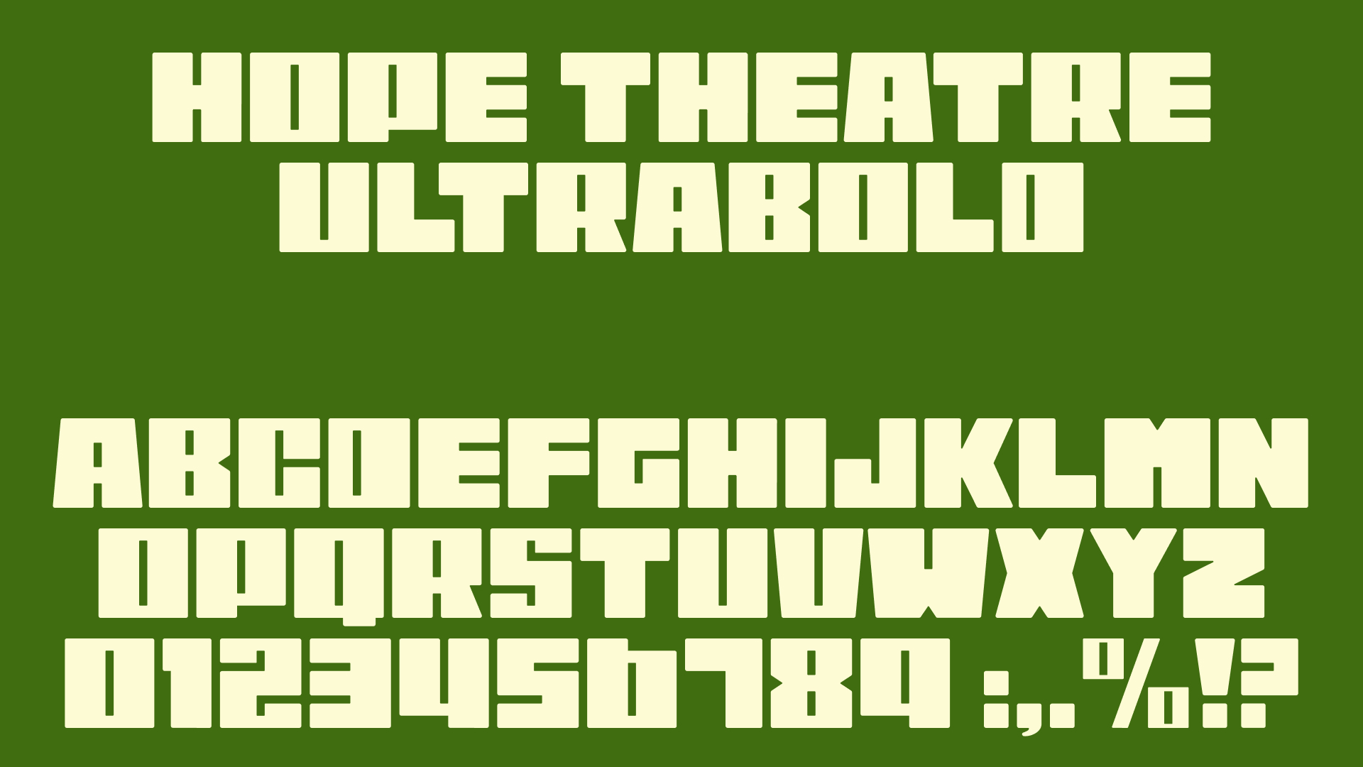
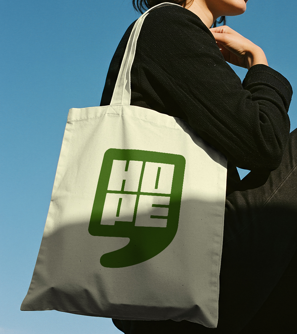
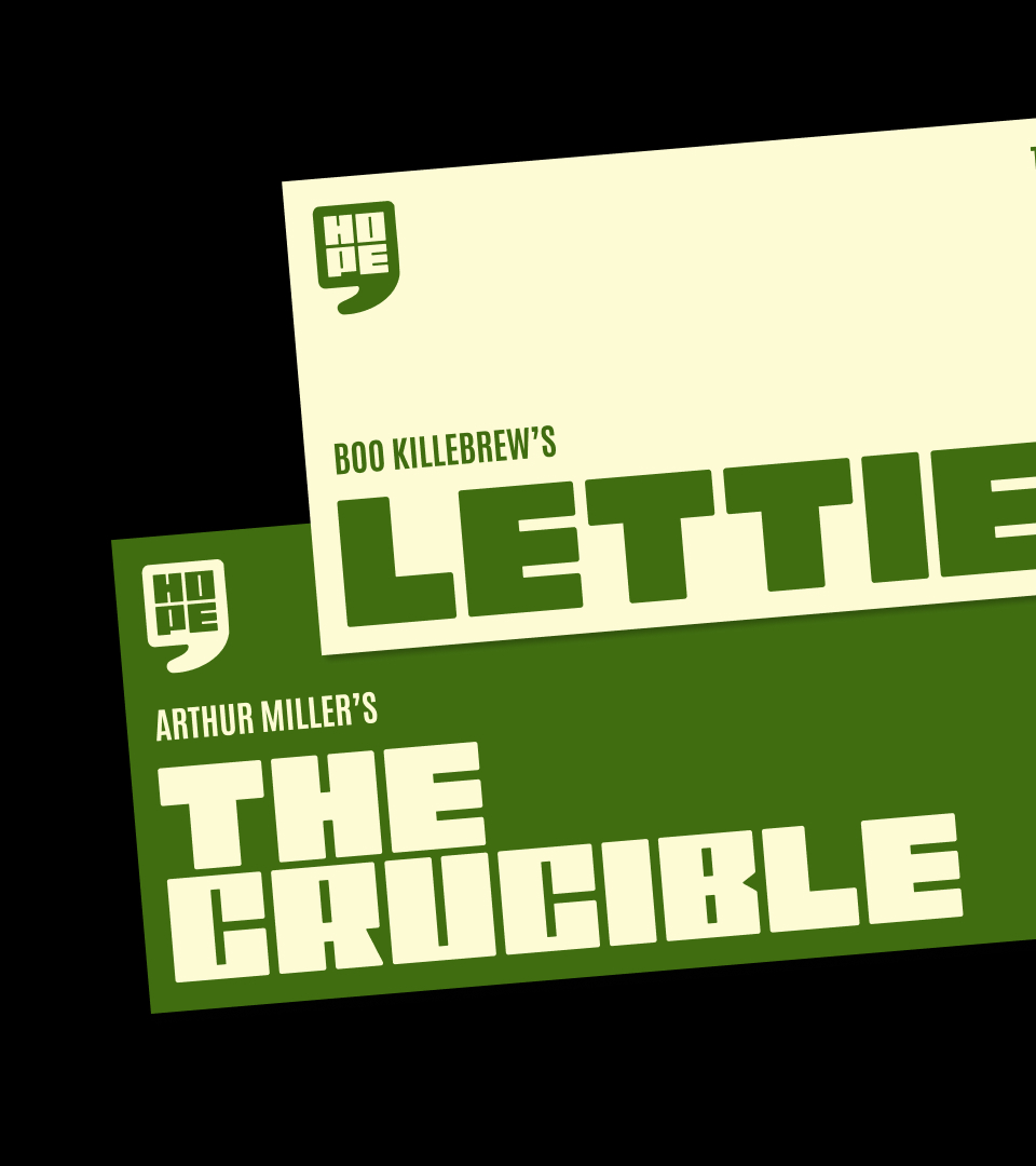
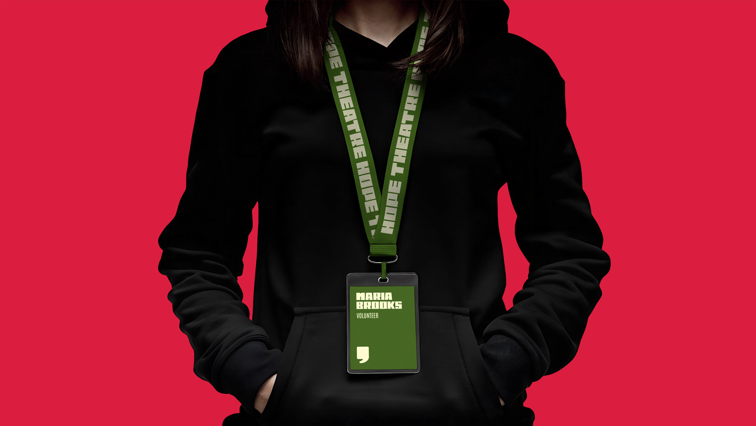
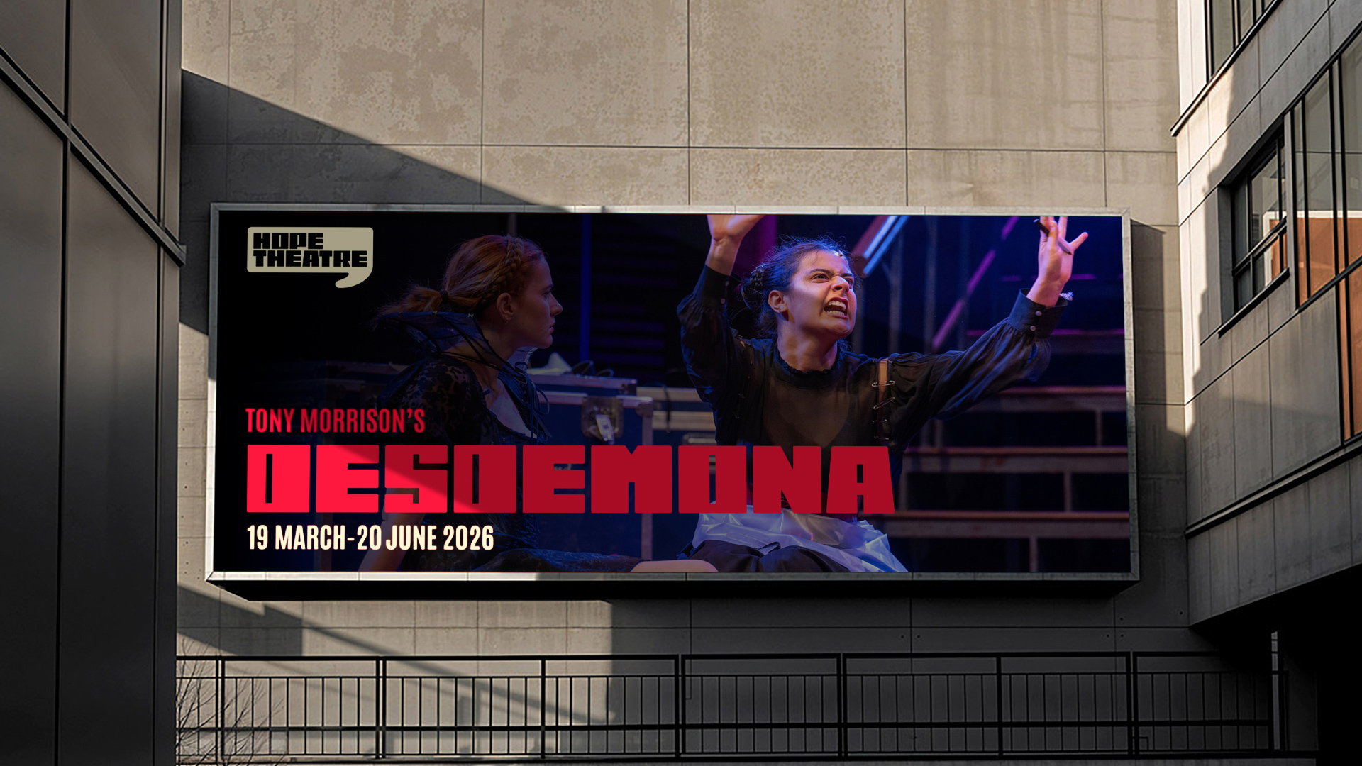
The logo is a custom, bold and expressive wordmark paired with a container that is taken from the comma in our custom typeface, transforming into a speech bubble that implies there’s more to the story to be told. The mark works as a design system that can adapt across multiple applications.
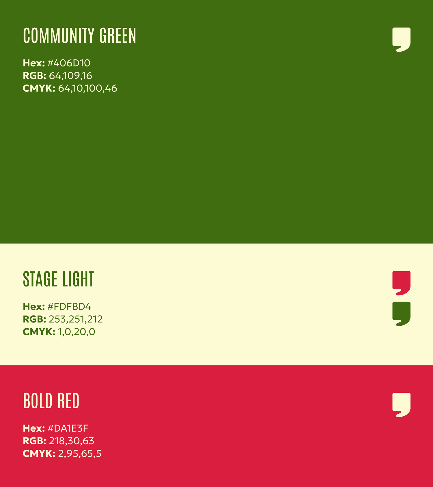
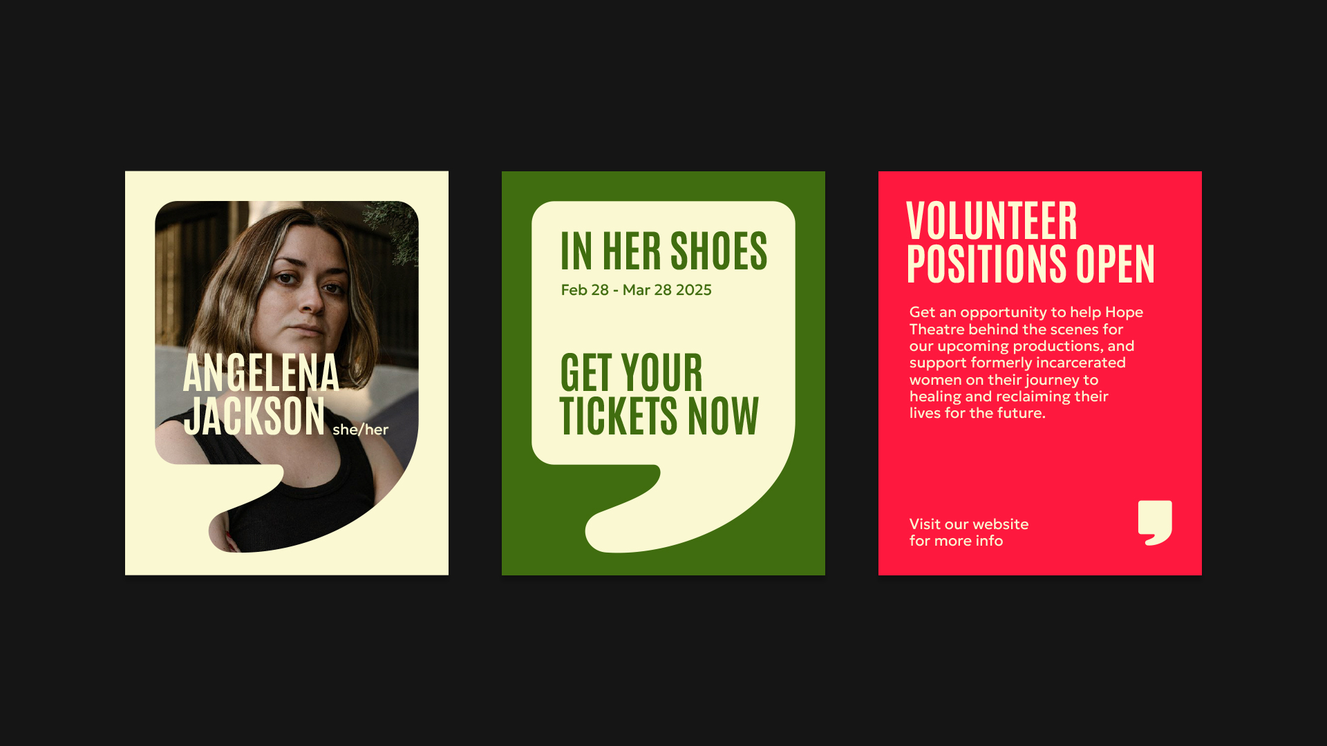
The original colour palette and overall art direction showcased in the mood board have been simplified in response to feedback, removing the colour brown and hand-drawn elements to maintain a clean identity without sacrificing feelings of hope and encouragement.